
Undoubtedly, any entry-level accounting or finance position will utilize spreadsheet programs like Excel or Google Sheets. These programs' many features and functions make it easy for analysts to review and interpret data that otherwise would be near impossible with only manual manipulation. One powerful feature in these programs for data analytics is the pivot table. With pivot tables, users can organize and analyze large sets of data in a matter of minutes. Knowing how to utilize them will help you immensely in entry-level accounting and finance positions.
Let's explore how pivot tables work and go through some examples to help you familiarize yourself with them as an entry-level employee.
What Are Pivot Tables and How Do They Work?
As the name suggests, A pivot table takes a large amount of data and organizes it into an easy-to-read table that you can then pivot or manipulate in a way that best suits your needs. Commonly, they are used to summarize data by categories and subcategories. Users can summarize categories of data using different calculations like Sum, Count, Average, etc., to display the data in the pivot table. Not to be confused with VLOOKUP, which retrieves single values from another table, pivot tables are ideal for summarizing large datasets.
Examples of Pivot Tables in Entry-Level Roles
To better understand how to build and interpret a pivot table, we'll look at two examples for both a finance and accounting entry-level role.
Example 1: Analyzing Financial Data
In this first one, let's look at a finance-related example while learning how to build a pivot table. In this case, you are a finance analyst who wants to help your client understand and interpret their stock portfolio. The client has provided you with the following set of data to use in your analysis. The table has identifying information about the varying investments the client has made, along with quantitative data.
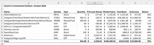
Your client asks to see the market value of their investments by type (stock, mutual fund, ETF, or digital asset) and look at their average gain or loss, and return. You decide the best way to present this data to your client is to create a pivot table.
To create the pivot table in Excel for Windows, go to Insert on the top ribbon and then select Pivot Table. Select the table range from which you want to create the pivot table which in this case is columns A-J and rows 3-13.
Hint: If your data is clean with no blank columns in your existing data, and your cursor is somewhere in the data, the program will automatically select the range of your data.
Then select where you want the pivot table to go. You can either select somewhere in the current worksheet or a new worksheet. Finally, click OK.
Your screen will look like this:
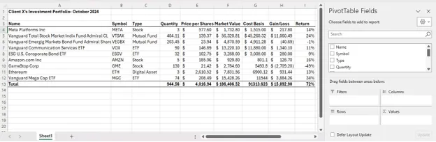
From here you can select the columns and rows you want to show in your pivot table. To show the client the market value of their investments by type in the pivot table, select Type under Rows and Sum of Market Value under Values.
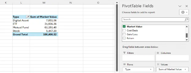
Additionally, you can have the pivot table perform different functions besides Sum. To show the average gain or loss by investment type or average return, select the drop-down arrow under Values next to Gain/Loss, select Value Field Setting, and choose Average.
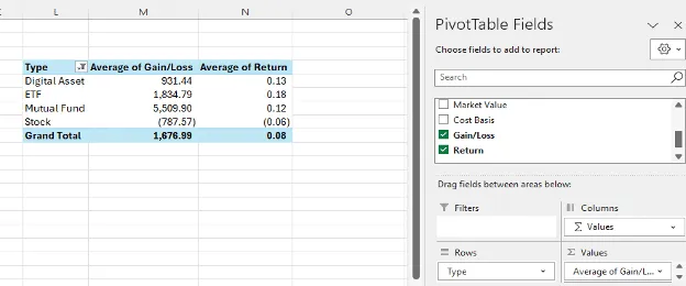
Once you have the pivot table summarizing the data you want to share with your client, you can take it a step further and format the table design depending on preference.
Now that we know how to create a pivot table let's look at another example where you can utilize pivot tables in your entry-level accounting role.
Example 2: Analyzing Revenue and Expenses
In this example, you want to analyze financial data of your accounting firm to present to partners from each office so they evaluate how each practice and service line are performing compared to each other and other offices.
You are provided with the following data showing gross revenue, variable and fixed costs, and net revenue by practice, service line and office location.
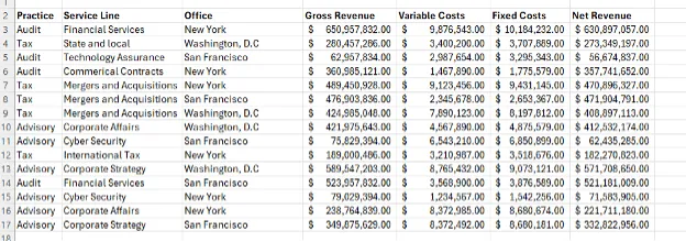
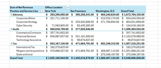
You need to summarize the net revenue for each practice and service line. You decide to create a pivot table so it easy for each partner to read and interpret the data. The rows of your pivot table are the different practices and broken down further by service line. Then you further break out the data by office location so each office can see how they are doing relative to each other. Some of the cells are blank since not all offices have every service line.
With the data presented in the pivot table below, partners can easily assess how their office compares to other offices with the same service line. They can also see how their office practices compare to each other.
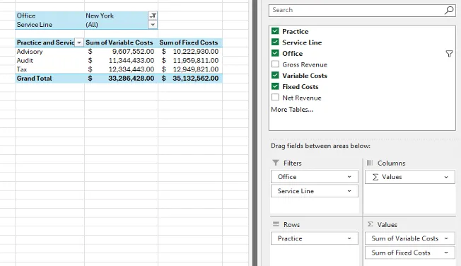
After sending this data to the partners, the New York office partner asks to take a closer look at his office's practice costs to review practice spending. You can easily extract this data by making edits to the pivot table. You create a new pivot table summarizing fixed and variable costs and filter it by office and service line as shown in the illustration below.
Conclusion
The pivot table is a powerful tool for summarizing and analyzing large datasets. Entry-level accountants and finance professionals utilize the tool in their day-to-day tasks for a variety of financial analysis and presentation. It is a relatively easy function to learn and master in programs like Excel and Google Sheets and can boost your skills to help you stand out compared to your peers.